Moving Beyond the Rule of Thirds
As DSLR bodies continue to offer more resolution, the opportunities on the editing table become increasingly flexible. Added resolution is a huge bonus for editors who have an interest in geometric composition and visual aesthetics as it allows for images to be cropped tighter without shedding valuable pixels. When it comes to composition though, photographers continue to give unanimous praise to the “rule of thirds” as the overarching principal, but it’s important to recognize that geometry and layout are a much more complicated beast, and you should never limit yourself within unnecessary creative confines.
Here are just a few approaches to generating a geometrically pleasing grid to assist in composition:

With these three patterns alone, you’re final composition will differ substantially. As most photographers consider the intersections to be ideal for the focal point, or in Camera Lucida terms – the punctum, you’ll find that when it comes to composing your image, you’ll have options.
Furthermore, structured grids are not the only suitable guidelines for image composition. The Fibonacci Sequence (0, 1, 1, 2, 3, 5, 8, 13, 21, etc.) is also an ideal candidate for generating aesthetically pleasing guides for composing your photos:

What I find most interesting is when you take various geometric patterns and combine them to discover common alignments. Of course, your results will vary depending on the image ratio, but that's really the fun of it. Have a look at these grid/spiral combinations, and see if you can find any pleasing alignments or intersects:

If you shoot wide, and your camera offers an abundance of resolution, I highly recommend playing around with various crops/layouts especially if you only plan to post to the web. It’s not to say that one method is better than another, but that geometric aesthetics ought to be considered as a flexible approach with room for creativity.
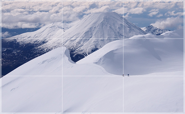
Here’s a photo cropped using the Rule of Thirds:
And again using the Golden Section:

And yet again, using the Angled Bisection:

Although the same photo is used throughout, you’ll find that a much different look and feel surfaces based on how the image is composed. In the end, it comes down to which framing the photographer loves best, and what feeling he/she intends to bestow upon the viewer. So keep your compositions varied, your creativity unbounded, and your photos aesthetically pleasing, and your portfolio will benefit!